Zippin: Scalable UI for a Modern Finance App
A concept project showcasing structured components, design tokens, and seamless handoff for a financial app aimed at young adults.
Designing a System, Not Just Screens
A finance app needs more than a beautiful UI—it must be scalable, adaptable, and easy to implement.
Designing a System, Not Just Screens
A finance app needs more than a beautiful UI—it must be scalable, adaptable, and easy to implement.
Designing a System, Not Just Screens
A finance app needs more than a beautiful UI—it must be scalable, adaptable, and easy to implement.
Zippin was built with:
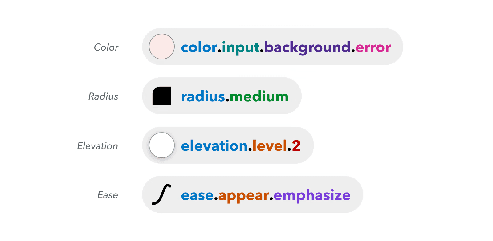
Design Tokens & Variables: Ensuring flexibility in themes & branding.
Component Properties: Creating modular, reusable UI elements.
Efficient Handoff: Making life easier for developers.ategorized spending insights.
Component Library Overview (Figma screenshot showing structured components, properties, and tokens in action.)
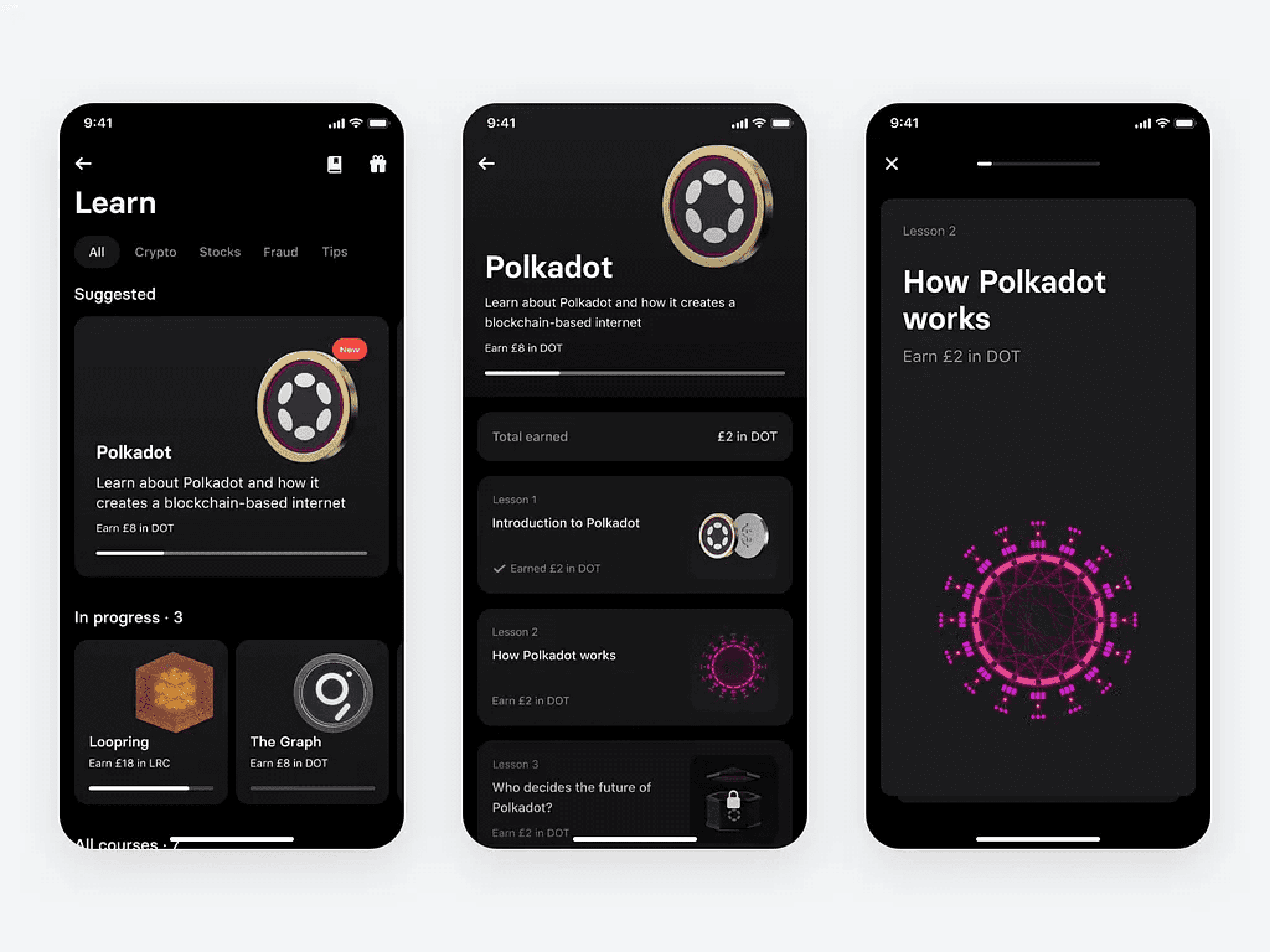
Effortless Transactions: The Core Money Flow
Sending money should be simple, fast, and intuitive.
Effortless Transactions: The Core Money Flow
Sending money should be simple, fast, and intuitive.
Effortless Transactions: The Core Money Flow
Sending money should be simple, fast, and intuitive.

3-5 static screens from the "Send Money" flow, transitioning from selecting a contact to confirmation.
This flow lets users:
1️⃣ Choose an amount quickly.
2️⃣ Select a recipient (contact list or QR scan).
3️⃣ Confirm with biometric/passcode authentication.
4️⃣ Get instant feedback with a success screen.
Design Impact
Minimal Steps, Maximum Clarity
A streamlined three-step process ensures users can send money quickly without confusion or unnecessary actions.
Minimal Steps, Maximum Clarity
A streamlined three-step process ensures users can send money quickly without confusion or unnecessary actions.
Minimal Steps, Maximum Clarity
A streamlined three-step process ensures users can send money quickly without confusion or unnecessary actions.
Seamless Verification
Biometric authentication adds an extra layer of security while keeping the process frictionless.
Seamless Verification
Biometric authentication adds an extra layer of security while keeping the process frictionless.
Seamless Verification
Biometric authentication adds an extra layer of security while keeping the process frictionless.
Reusable, Scalable Components
Modular design allows easy expansion of payment features without redesigning core interactions.
Reusable, Scalable Components
Modular design allows easy expansion of payment features without redesigning core interactions.
Reusable, Scalable Components
Modular design allows easy expansion of payment features without redesigning core interactions.
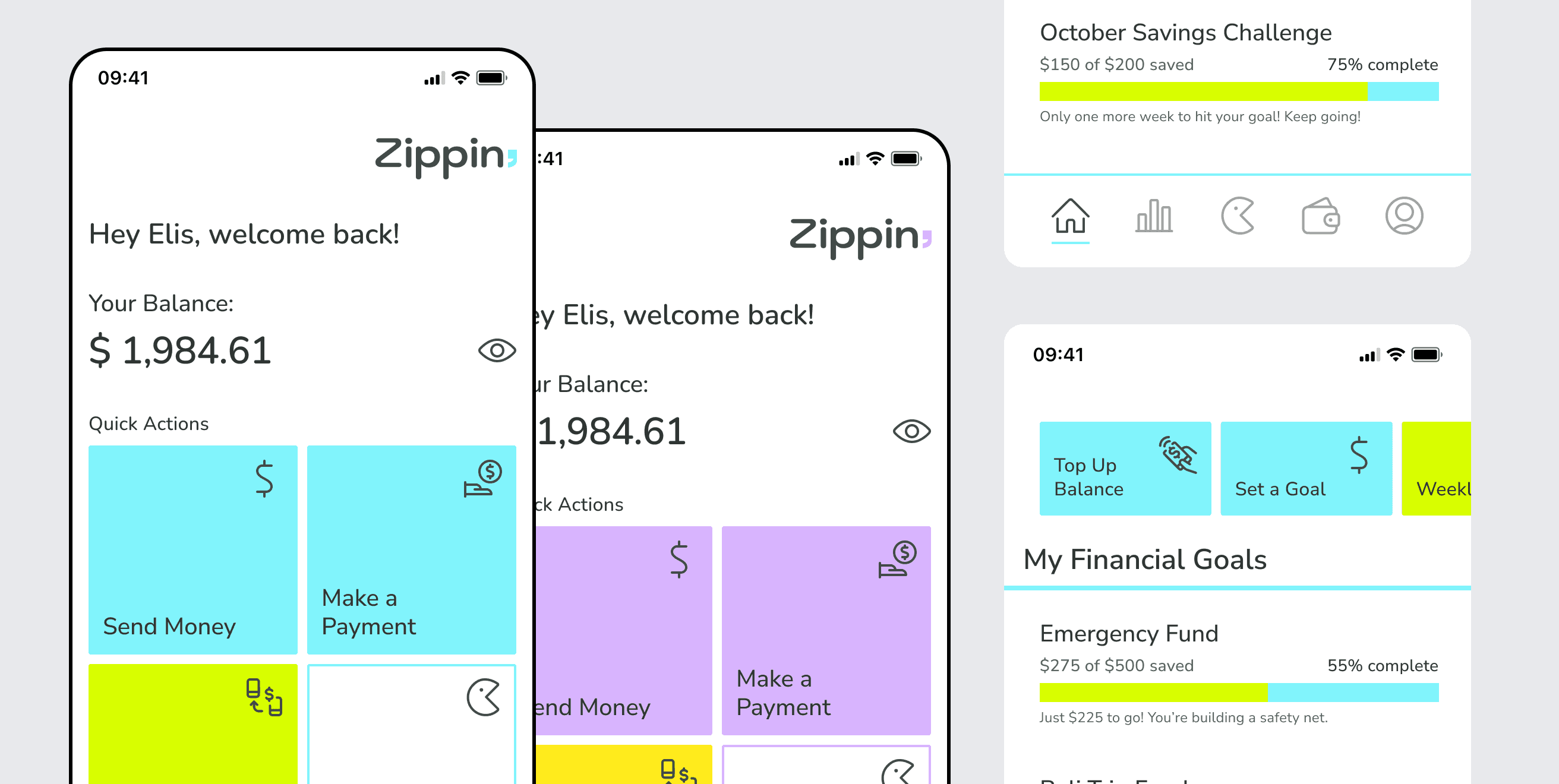
Making Finance Engaging: The Money Game
Young users need financial habits, not just transactions. The Money Game turns spending awareness into interactive challenges.
Making Finance Engaging: The Money Game
Young users need financial habits, not just transactions. The Money Game turns spending awareness into interactive challenges.
Making Finance Engaging: The Money Game
Young users need financial habits, not just transactions. The Money Game turns spending awareness into interactive challenges.
Users can
Set weekly/monthly spending goals.
Earn badges for mindful spending.
Compete with friends (optional).
Screens from the Money Game flow, highlighting progress tracking and rewards.
Why It Works
Gamified Experience, Real-World Skills
The game turns financial learning into engaging challenges, helping users build better money habits.
Gamified Experience, Real-World Skills
The game turns financial learning into engaging challenges, helping users build better money habits.
Gamified Experience, Real-World Skills
The game turns financial learning into engaging challenges, helping users build better money habits.
Progression & Rewards Drive Engagement
Users stay motivated with goals, achievements, and streaks that reinforce financial responsibility.
Progression & Rewards Drive Engagement
Users stay motivated with goals, achievements, and streaks that reinforce financial responsibility.
Progression & Rewards Drive Engagement
Users stay motivated with goals, achievements, and streaks that reinforce financial responsibility.
Seamless Integration into the App
Players earn real insights while staying within their banking experience, making financial literacy effortless.
Seamless Integration into the App
Players earn real insights while staying within their banking experience, making financial literacy effortless.
Seamless Integration into the App
Players earn real insights while staying within their banking experience, making financial literacy effortless.
Clear & Organized: Transaction Details
Users should understand their spending at a glance.
Clear & Organized: Transaction Details
Users should understand their spending at a glance.
Clear & Organized: Transaction Details
Users should understand their spending at a glance.
This screen breaks down transactions visually – with:
Categorized spending insights.
Quick actions for recurring payments.
A clean, structured UI for clarity.

Transaction Details screen, showing structured breakdowns.
Why It Works
Fast & Clear Navigation
The UI surfaces key financial actions with minimal cognitive load, helping users complete tasks without hesitation.
Fast & Clear Navigation
The UI surfaces key financial actions with minimal cognitive load, helping users complete tasks without hesitation.
Fast & Clear Navigation
The UI surfaces key financial actions with minimal cognitive load, helping users complete tasks without hesitation.
Smart Predictive Design
Transaction history and spending insights are structured to highlight the most relevant information first.
Smart Predictive Design
Transaction history and spending insights are structured to highlight the most relevant information first.
Smart Predictive Design
Transaction history and spending insights are structured to highlight the most relevant information first.
Distraction-Free Interface
Clean layouts, structured spacing, and intuitive hierarchy enhance readability and usability.
Distraction-Free Interface
Clean layouts, structured spacing, and intuitive hierarchy enhance readability and usability.
Distraction-Free Interface
Clean layouts, structured spacing, and intuitive hierarchy enhance readability and usability.
Adapting to User Preferences: Themes & Customization
Zippin includes two theme variations—each modifying color palettes, typography, and component shape (rounded vs. squared corners).
Adapting to User Preferences: Themes & Customization
Zippin includes two theme variations—each modifying color palettes, typography, and component shape (rounded vs. squared corners).
Adapting to User Preferences: Themes & Customization
Zippin includes two theme variations—each modifying color palettes, typography, and component shape (rounded vs. squared corners).
Why It Matters
User-Centered Adaptability
Themes adjust color, typography, and shape preferences while keeping the UI consistent and familiar.
User-Centered Adaptability
Themes adjust color, typography, and shape preferences while keeping the UI consistent and familiar.
User-Centered Adaptability
Themes adjust color, typography, and shape preferences while keeping the UI consistent and familiar.
Scalable Branding for Future Growth
The system is built to accommodate new visual styles and customization without breaking the experience.
Scalable Branding for Future Growth
The system is built to accommodate new visual styles and customization without breaking the experience.
Scalable Branding for Future Growth
The system is built to accommodate new visual styles and customization without breaking the experience.
Effortless Maintenance with Design Tokens
Variables allow quick updates, reducing the need for manual adjustments across components.
Effortless Maintenance with Design Tokens
Variables allow quick updates, reducing the need for manual adjustments across components.
Effortless Maintenance with Design Tokens
Variables allow quick updates, reducing the need for manual adjustments across components.

Theme comparison mockup (showing the same UI in two styles—one rounded, one squared).
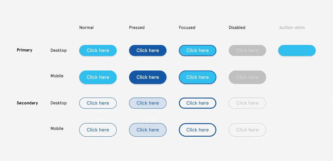
Seamless Handoff for Developers
A great UI only works if developers can implement it efficiently.
Seamless Handoff for Developers
A great UI only works if developers can implement it efficiently.
Seamless Handoff for Developers
A great UI only works if developers can implement it efficiently.
Zippin removes friction by:
Using clearly named components & structured layers.
Defining consistent design tokens to speed up updates.
Keeping Figma clean & annotated for easy reference.
Screenshot of organized component library & tokens in Figma.
Impact on Handoff
Structured Components for Developers
Clear naming conventions and organized layers reduce back-and-forth during implementation.
Structured Components for Developers
Clear naming conventions and organized layers reduce back-and-forth during implementation.
Structured Components for Developers
Clear naming conventions and organized layers reduce back-and-forth during implementation.
Consistent Design Tokens & Variables
Predefined styles ensure UI elements remain cohesive across the entire product.
Consistent Design Tokens & Variables
Predefined styles ensure UI elements remain cohesive across the entire product.
Consistent Design Tokens & Variables
Predefined styles ensure UI elements remain cohesive across the entire product.
Developer-Ready Files with Annotations
Well-documented components make it easier for engineers to understand behaviors and variations.
Developer-Ready Files with Annotations
Well-documented components make it easier for engineers to understand behaviors and variations.
Developer-Ready Files with Annotations
Well-documented components make it easier for engineers to understand behaviors and variations.
Projected Impact: Why This Approach Matters
Although conceptual, Zippin’s methodology mirrors real-world design challenges, improving collaboration, consistency, and efficiency.
Projected Impact: Why This Approach Matters
Although conceptual, Zippin’s methodology mirrors real-world design challenges, improving collaboration, consistency, and efficiency.
Projected Impact: Why This Approach Matters
Although conceptual, Zippin’s methodology mirrors real-world design challenges, improving collaboration, consistency, and efficiency.
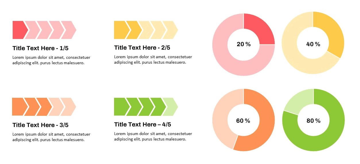
Infographic showing projected impact metrics (faster implementation, improved consistency, reduced redesign time).
Projected Outcomes
Faster Engineering Implementation
Pre-built styles and components reduce development time by minimizing manual UI adjustments.
Faster Engineering Implementation
Pre-built styles and components reduce development time by minimizing manual UI adjustments.
Faster Engineering Implementation
Pre-built styles and components reduce development time by minimizing manual UI adjustments.
Stronger UI Consistency
Global tokens ensure that updates are applied instantly across all elements without inconsistencies.
Stronger UI Consistency
Global tokens ensure that updates are applied instantly across all elements without inconsistencies.
Stronger UI Consistency
Global tokens ensure that updates are applied instantly across all elements without inconsistencies.
Reduced Design Debt for Long-Term Scalability
A structured system prevents unnecessary rework and keeps the UI future-proof.
Reduced Design Debt for Long-Term Scalability
A structured system prevents unnecessary rework and keeps the UI future-proof.
Reduced Design Debt for Long-Term Scalability
A structured system prevents unnecessary rework and keeps the UI future-proof.
Key Takeaways
Key Takeaways
Key Takeaways
Systematic Design for Scalability
Building with design tokens and structured components ensures a scalable, adaptable UI system that evolves effortlessly with product needs.
Systematic Design for Scalability
Building with design tokens and structured components ensures a scalable, adaptable UI system that evolves effortlessly with product needs.
Systematic Design for Scalability
Building with design tokens and structured components ensures a scalable, adaptable UI system that evolves effortlessly with product needs.
Seamless Handoff for Developers
Organized components, clear documentation, and developer-ready assets speed up implementation, reducing rework and inconsistencies.
Seamless Handoff for Developers
Organized components, clear documentation, and developer-ready assets speed up implementation, reducing rework and inconsistencies.
Seamless Handoff for Developers
Organized components, clear documentation, and developer-ready assets speed up implementation, reducing rework and inconsistencies.
Theme-Driven Flexibility
Customizable color, typography, and corner radius tokens allow seamless brand adaptation, ensuring a consistent, polished experience.
Theme-Driven Flexibility
Customizable color, typography, and corner radius tokens allow seamless brand adaptation, ensuring a consistent, polished experience.
Theme-Driven Flexibility
Customizable color, typography, and corner radius tokens allow seamless brand adaptation, ensuring a consistent, polished experience.
Efficiency in Design & Execution
Pre-built modular elements and structured UI libraries accelerate workflows, reducing redundant design work and improving team efficiency.
Efficiency in Design & Execution
Pre-built modular elements and structured UI libraries accelerate workflows, reducing redundant design work and improving team efficiency.
Efficiency in Design & Execution
Pre-built modular elements and structured UI libraries accelerate workflows, reducing redundant design work and improving team efficiency.
Next Steps
Explore microinteractions & transitions for enhanced UX.
Expand design system capabilities.
Implement responsive behavior & additional flows.
Final Thoughts
Zippin is a testament to structured UI thinking—a design system built not just for aesthetics, but for efficiency, scalability, and seamless implementation.
Final Thoughts
Zippin is a testament to structured UI thinking—a design system built not just for aesthetics, but for efficiency, scalability, and seamless implementation.
Final Thoughts
Zippin is a testament to structured UI thinking—a design system built not just for aesthetics, but for efficiency, scalability, and seamless implementation.

Showcase of polished UI screens & structured component library.
Next Project

